


Why did we make this adjustment?
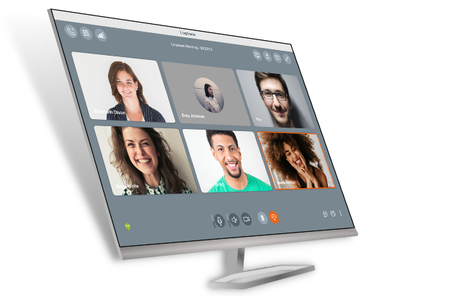
The Linphone app can be used on different terminals: smartphone, desktop, and tablet. In recent years, "new generation" phones have emerged on the mobile market. Therefore, we felt it was important to adapt our app to the features and technical specifications of these new smartphones so the user can take full advantage of their capabilities. Linphone has now adjusted its interface for foldable phones.
How did we do this?
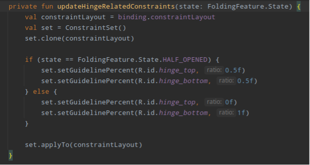
First, we had to redesign the view to replace the layout using ConstraintLayout, a tool provided by the Android API. This has the advantage of allowing the user to position elements more precisely and change these constraints in real-time. Second, we had to rethink the current design so the display exploits the screen in a harmonious and optimised way according to the different folding possibilities (flip or fold). Finally, we had to add to the app a code that detects when a phone is folded or unfolded so it can update the interface accordingly.
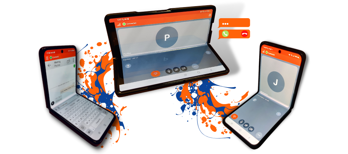
The phone adapts to its environment for browsing. If you decide to use your fold phone with the external screen, you will have a "classic smartphone" view, while if you decide to open it, you will have a tablet view. If you have a flip phone, you have two options: a classic phone view or a half-folded phone view. Both types of phone harmonise with the app; the moment you half-fold your smartphone, the separation will be at the exact place of the fold. The most important change takes place in the call view, which best shows the benefits of the revision. All the current features available in Linphone have been retained.
On the design side, a battery of tests have been conducted to obtain an ergonomic and fluid version of the app. The goal was to provide a more pleasant user experience through a dynamic adaptation of the interface.